This project is part of the Addepar interview process, in this design challenge, I'm asked to design an internal use only tool called Addepar Candidate Tracker for them to track interview candidates.
A reiterated version of Quick Glance is here.
Where do we begin?
The first thing I do is to identify the problem. With no knowledge in hiring process, I have to reach out and do some interview with people with actual hiring experience. Luckily, good people in Addepar gave me a lot of help. I interviewed their recruiter, Brianna and one of the interviewers, Hana Kim. They both been really helpful and gave me wonderful ideas, but with little time in my hand, I have to focus on one user scenario.
I decided to go with the interviewer's scenario, during my interview with Hana, I've listed two problems he mentioned I think are the most important:
- While reviewing a resume or portfolio, going back and forth between tabs is time consuming and troublesome. The note taking system should do better in this part.
- As an interviewer, Hana cares about the "flow" of a certain opening. He wants to make sure that enough candidates are applying for a certain opening and there are enough people in the process.
Persona
Based on these two insights, I came up with a persona, Jose Hopkins, a senior designer in Addepar, who also interviews people. Let's get to know Jose a little bit more.

Userflow
To better understand Jose's user behavior, let's take a look at Jose's user flow:

User pain points
- Jose has tasks to solve everyday, unfortunately, things like reviewing resume and portfolio are actually quite repetitive, how do we make this process easier while helps Jose to keep track of which candidate he is reviewing?
- Jose needs to know the flow of openings, with all the numbers we have, how do we give these numbers meanings? Could we provide him a more intuitive way to understand these numbers? Could it even be a simple data visualization?
- With so many candidates to keep track and view, to speed up the process, Jose needs to do the most with the least clicks. Most of the things Jose needs to tackle should be completed in one page instead of different pages
First attempt
I tried several different designs in the beginning

In the first version of it, I was focusing on the note taking part and how to better keep track of the candidates status. I soon came up with the idea of a floating, always there note section, as like below are two early attempts of it:


In this early version of design, I also tried to gamified the process. Yellow exclamation mark often means "new quest" in modern RPG and I think it could be a potentially good/fun idea to use the symbol to indicate that this candidate has a "new quest" for you. But I soon abandoned the idea, due to the fact not everyone is familiar with video game reference and I could be the only one who love this idea. The idea of a status bar/timeline also came to me in this stage.

Not before long that I discovered the bad of this early design: It takes too many clicks. In this design, every candidate's profile takes a whole page, the user has to click "back" to go back to candidates list. While the design solved the problem of taking notes, it just takes too many clicks. Thus I started from scratch, aimed to create a design that takes less clicks but can also do the same amount of work.
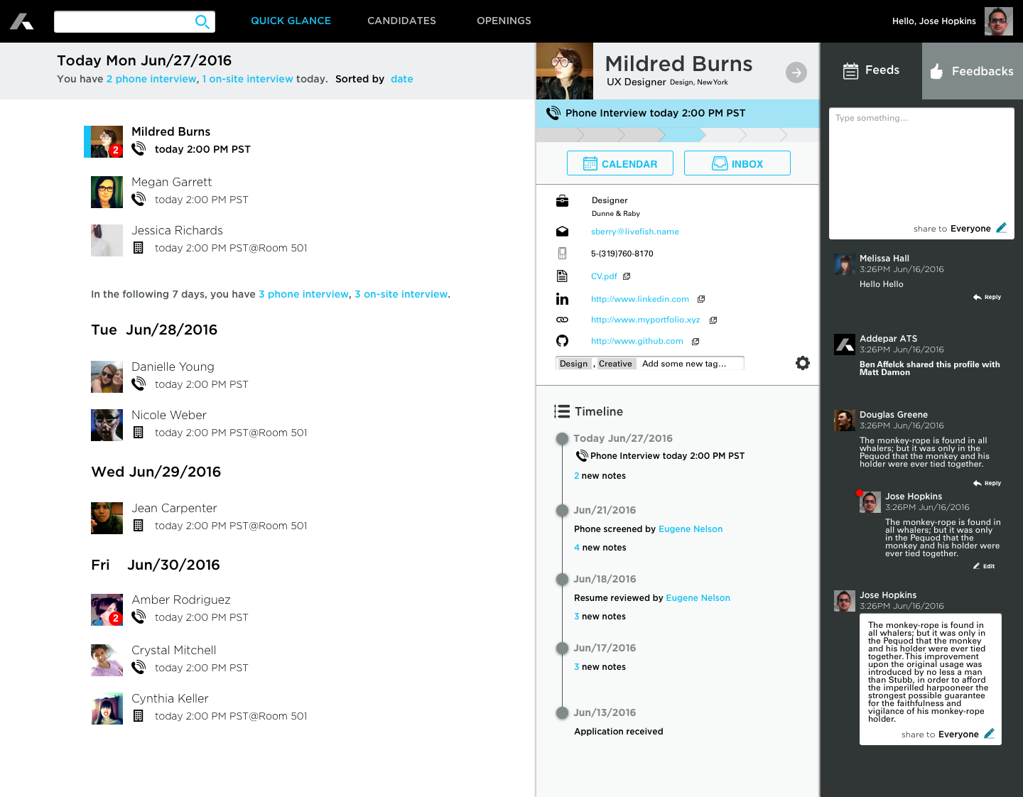
Final Design
After some thoughts, I've divided the screen to 4 different sections like this:

With Quick Glance, Jose can now get a holistic view about what he needs to do with the candidates. When he click on a candidate, the detailed view will slide out from the right, giving Jose a better understanding about the selected candidate. With the Feeds view's note taking function. Jose doesn't need to leave the page he's viewing or open a new tab to take note. Now, He could take note, see others notes and see all the updates about the page he's viewing in one place.
Jose can also skim through all the candidates at a glance, and he can also sorted them anyway likes.
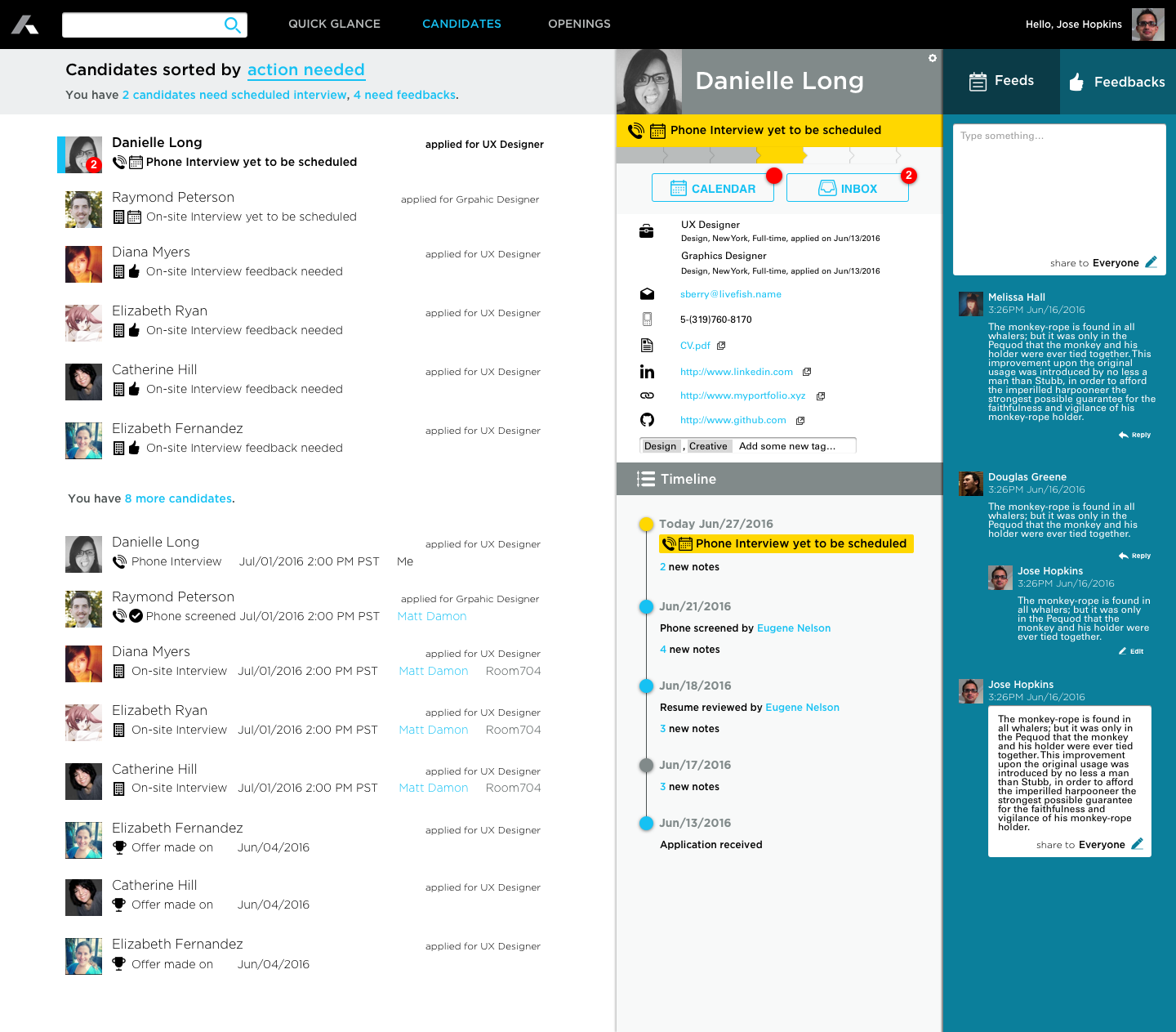
When it comes to the flow of a opening, Jose also gets a new tool

Apart from all the number he needs to understand the flow, Jose can now see the line graph of the job opening to have a graphical idea and chronological sense of the job opening. All the lines can be toggled on or off. As you can see, the Feeds view changes depends on what the main content is, for example, a Feedback wouldn't be necessary in this case so it's only showing the Feeds tab.
Reiteration
Sally and Yisi gave me some feedback during the interview, including repetitive information, too many colors and information overwhelmed, etc. I took a few minutes to reiterate the design of Quick Glance. Now it has less color, which should also feels more "enterprise" and I took of a lot of repetitive information with minor tweaks on icons. The whole panel looks cleaner now.